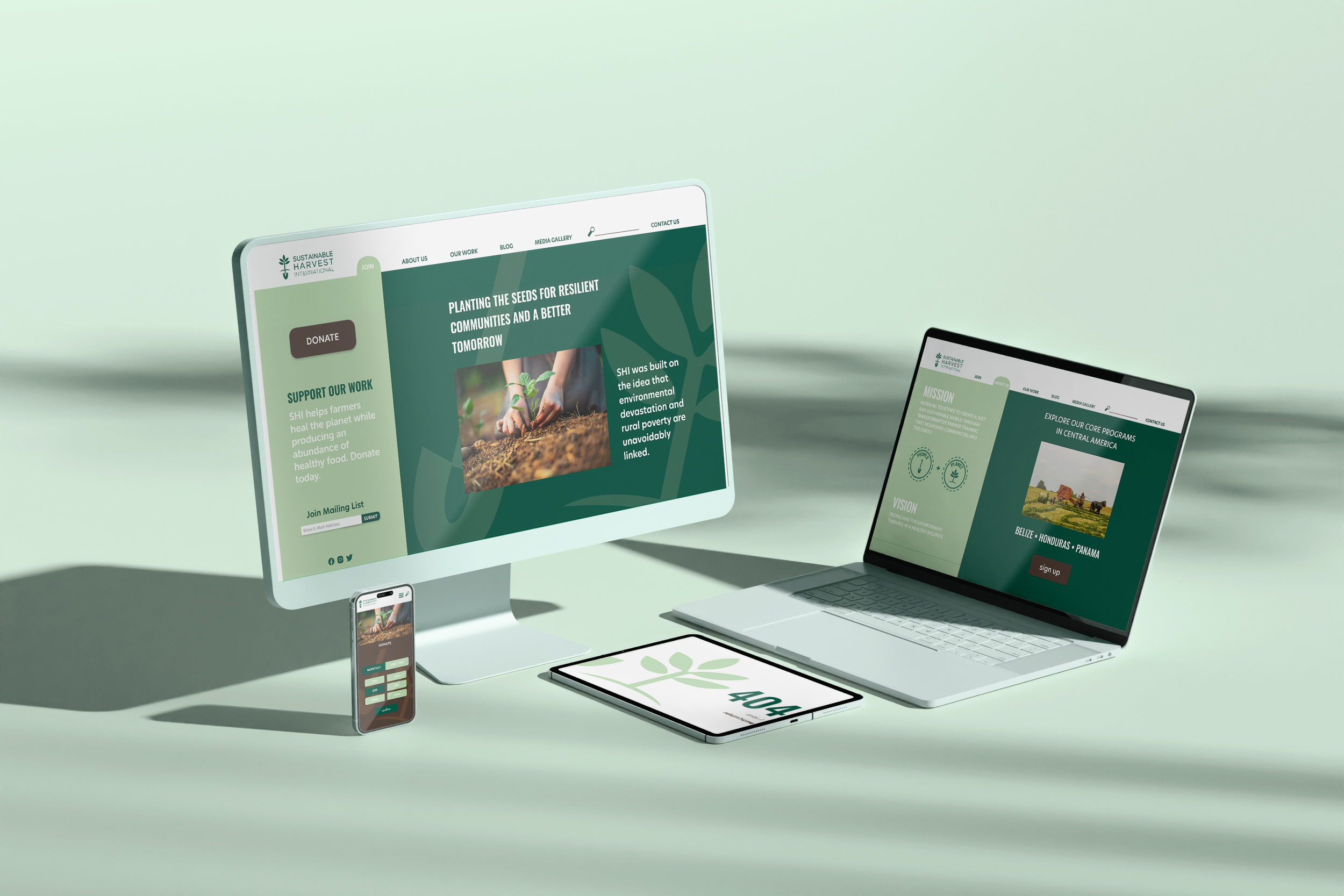
SHI Mobile App Design and Web Redesign
Problem
Sustainable Harvest International (SHI) struggled with a common web design challenge—an overwhelming amount of information disrupting user flow and navigation.
Solution
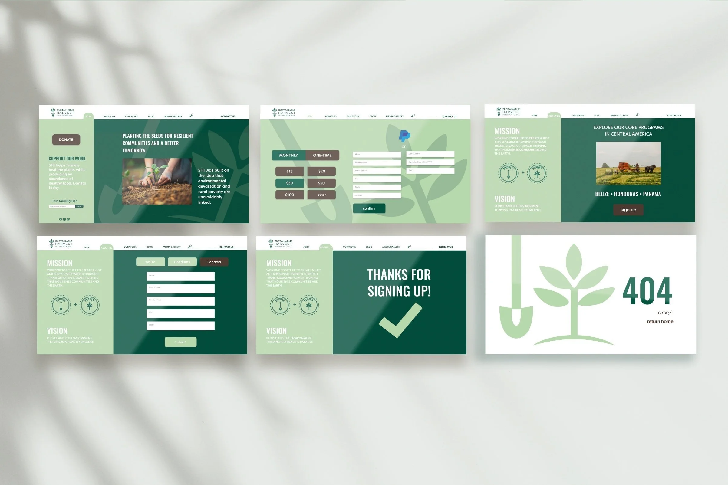
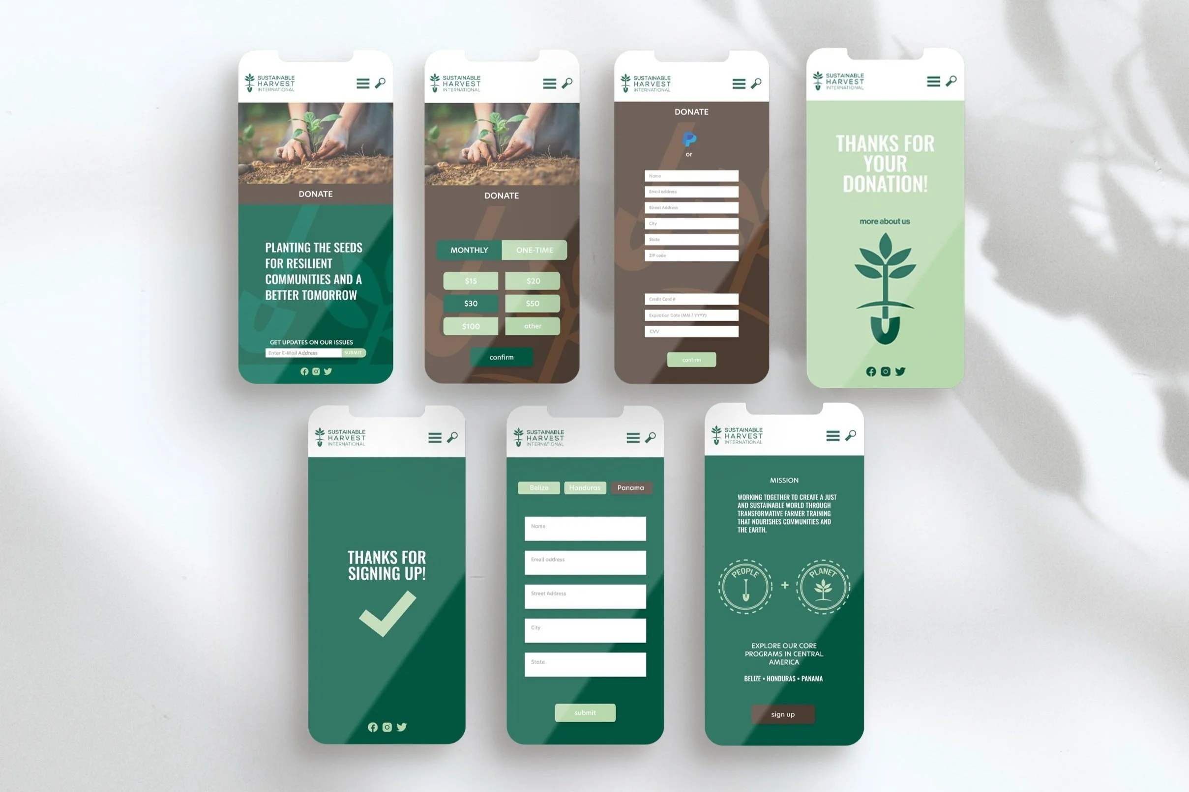
In designing the app and redesigning SHI’s website, my focus was on optimizing the user experience by simplifying navigation and guiding visitors toward key objectives like donating and enrolling in SHI’s training programs.
Final Deliverables
User Navigation
Fresh Palette and Type
#0e5241
#bcd3b1
#483a32
#e08920
Process
Initial thoughts researching and testing original website:
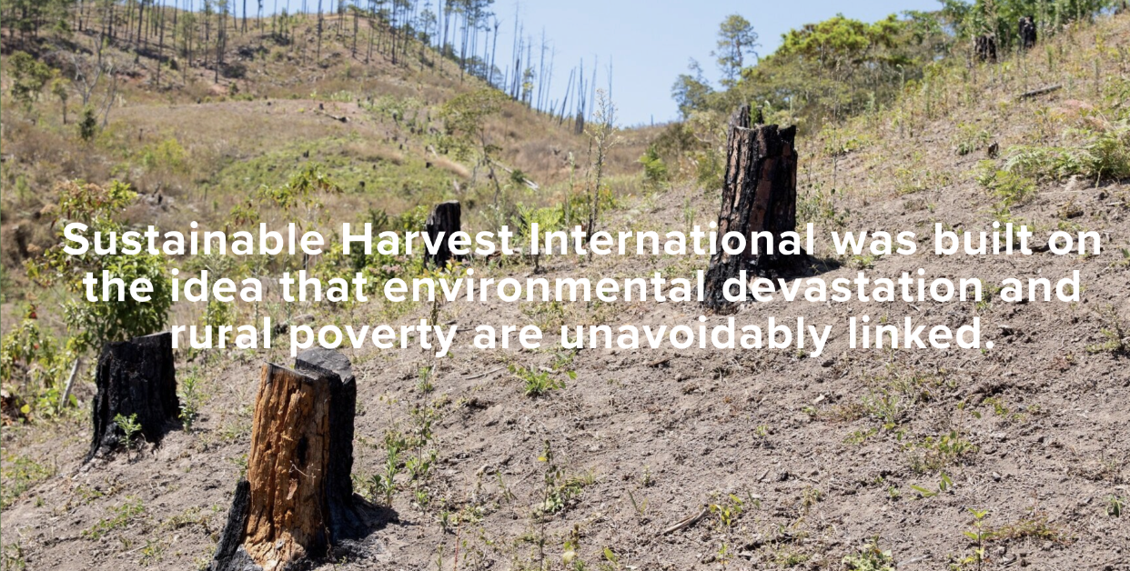
Text lacks accessibility due to low contrast with photo
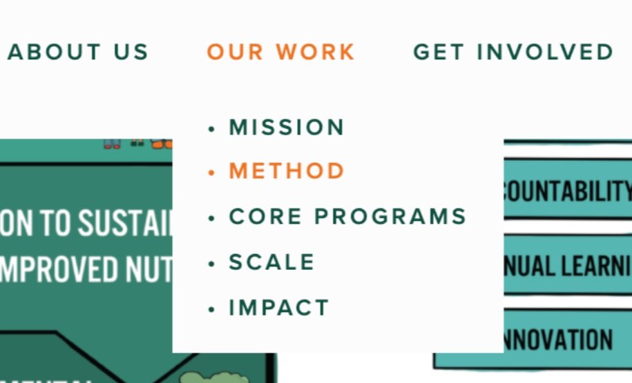
User flow is overly complicated because of how many options and content there is
Takes too long to navigate to the core programs page
Heuristic Analysis / User Testing for existing site
Information Architecture for existing site
